
Twenty years in and with a client base that includes Fortune 500 companies across the globe, Future Today Strategy Group has earned its place as a recognized leader in strategic foresight – but it all started with a report.
A trend report.
For nearly two decades, FTSG has published an annual tech trends report to widespread acclaim. During that time, the report’s content and creative have matured – growing in scope as well as depth. As the company’s lead designer for the past decade and now creative director, I have guided its visual journey.
These days, most companies put out some kind of trend report. A big reason ours has always connected with audiences is because it provides a unique, long-term perspective. We’re not identifying things that are already happening – we’re identifying things that are about to happen.
Another reason our trend report resonates is because of its design, which is where I come in.
Design isn’t just about making things look good for the sake of aesthetics. For our trend report, design is a tool to organize complex information. It provides the reader with structure and clarity. But design also does something more. Design turns a report into an experience.
Here at FTSG, we develop plausible scenarios about the future. Scenarios are basically facts and evidence dressed up with creative writing. They exist to make a yet-to-exist world feel real, so that decision-makers feel a sense of urgency. The same philosophy drives the creative direction of our trend reports: design makes trends come to life.
Every year, I work directly with our CEO, Amy Webb, to develop a design style or theme to make the upcoming report more than just a list of trends. Each encompasses a whole suite of creative elements tied to her annual featured session at SXSW. Amy studies the signals she’s tracking, develops a thesis based on that data, and builds it out into a sort of overarching philosophy. This philosophy extends past the report and Amy’s speech, shaping our perspective for the year ahead.
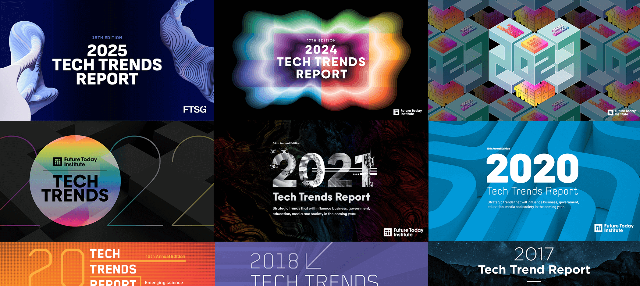
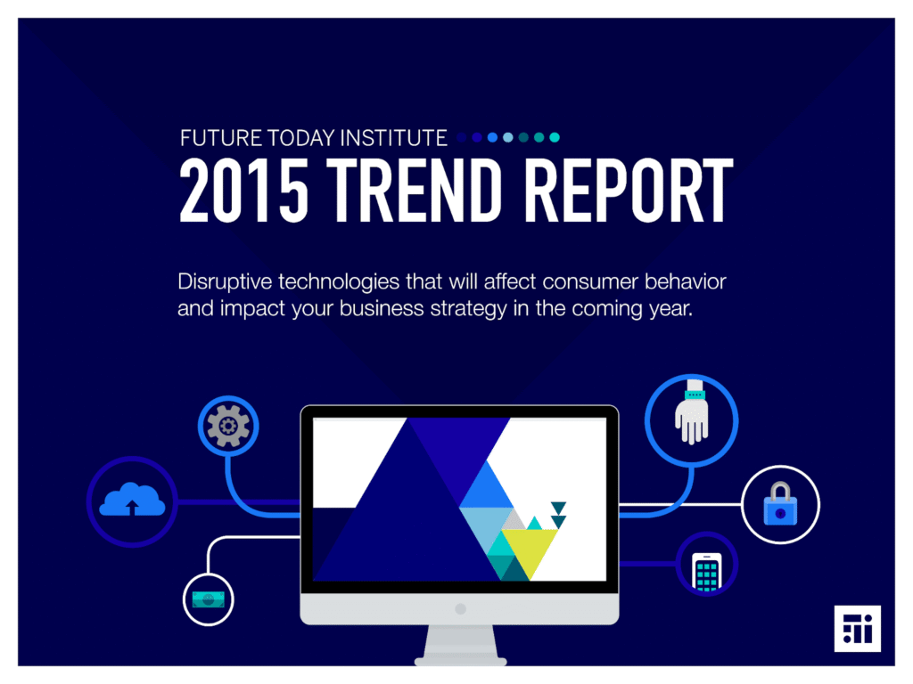
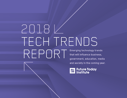
When I began working on the Trend Report in 2015, however, we didn’t have a theme to glue it all together. It was simply 55 trends about emerging technologies spread across 52 pages. Each had sections for“Key Insights” and “Examples” and “What’s Next” – foundational elements that we have continued to include to this day. It was the heyday of flat illustration, so we leaned into that style for the cover and throughout the report.
Over the next few years, we refined both the structure and the design, experimenting with ways to better convey dense information. But it wasn’t until 2020 that the design became central to the report’s identity, thanks to two key milestones.
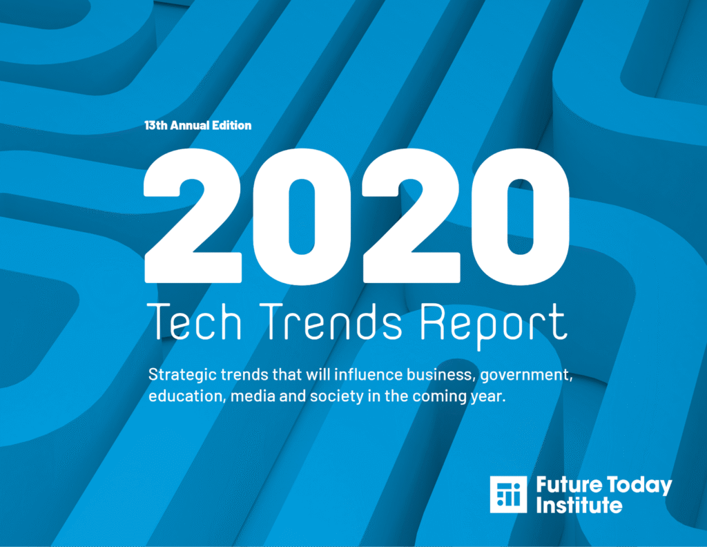
First, it was the last report we put out as a single book. By that point the report had grown to 366 pages and included scenarios. It needed to be separated into volumes for ease of use.
It was also the year Amy introduced a unifying theme — The Roaring 2020s — drawing parallels between the current world and the 1920s: a decade of optimism and technological progress shadowed by instability, market crashes, and rising extremism.
Our creative direction reflected this duality. We paired black-and-white photography with flat color shapes, fusing contrasting elements into a unified story. Explaining complex technologies often means asking readers to imagine unfamiliar ideas, so my goal was to create visuals that offered both context and emotion. The 2020 report marked a turning point. We began telling two stories, one in words and one with imagery.
Our 2021 trend report focused on the theme of reinvention. This was our first trend report since the onset of the pandemic, a time of deep uncertainty. Fittingly, we reinvented the format itself. We pivoted from putting out a single giant report to creating 12 separate volumes, with each focusing on a cluster of related trends. We gave every volume its own number and color, turning the numbering into part of the artwork, and we evolved our collage approach into full-color compositions that captured the distinct mood of each topic.

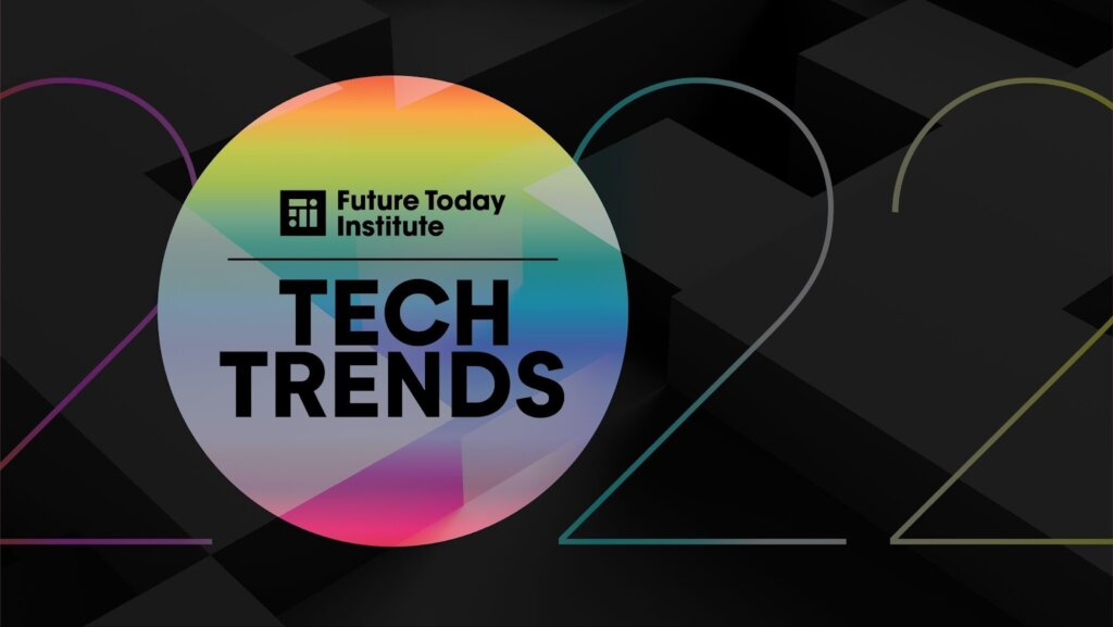
In 2022, our theme was re-perception. Amy wanted to address the idea of being awake to the possibility of a future that differs from your current expectations. The main background on each cover portrayed an optimistic view of the future – but each cover also had a “hole” through it. In that hole was a glimpse of a world where everything went wrong. The climate book, for example, showed the Statue of Liberty underwater.
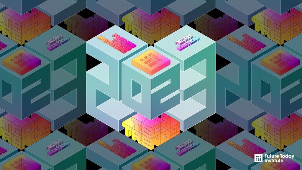
The following year, our theme was focus. Amy emphasized how it is crucial to focus when new signals are forming because some may be lasting and develop into impactful trends, while others might burn out and fade away. On the creative side, we moved away from the collage style we had been using for the past few reports and asked ourselves, “How can we focus better? Can we represent these complex ideas with only typography and color?” We leaned into the challenge.
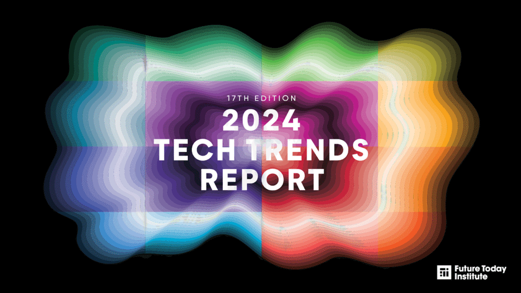
Our theme in 2024, the technology supercycle, began as an observation and turned into a full-blown academic thesis. It has since shaped conversations across industries about the scale and speed of technological change. In Amy’s opening letter she wrote, “We believe we have entered a technology supercycle. This wave of innovation is so potent and pervasive that it promises to reshape the very fabric of our existence, from the intricacies of global supply chains to the minutiae of daily habits, from the corridors of power in global politics to the unspoken norms that govern our social interactions.”
We visualized the “supercycle” as an undulating radar-like pattern. Each of the 16 reports had a piece of the puzzle, with its own color and wave pattern. When viewed together, it formed a cohesive image of the supercycle in motion.
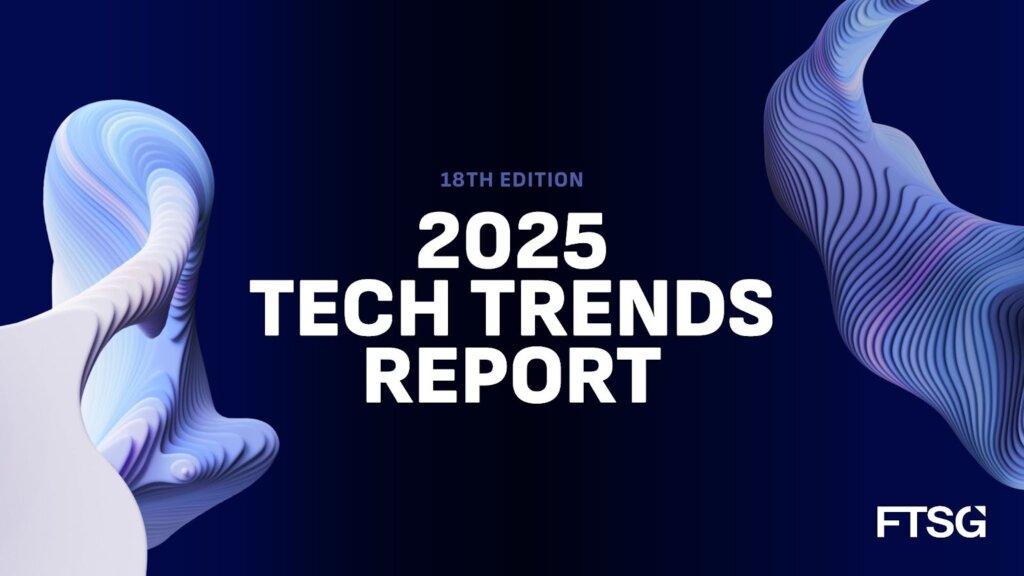
Finally, our theme in 2025, beyond, expanded on ideas from the technology supercycle. It captured the idea that technology has propelled humanity to cross multiple points of no return. We as humans have now moved “beyond our mental models, beyond biological constraints, beyond social norms” into uncharted territory.
Creatively, we embraced that ambiguity through amorphous, fluid shapes – here at FTSG, we can’t help but love a blob. It represents movement and constant change, and it felt like the right answer when entering the Beyond. Are we in space? Are we in the depths of the ocean? The shapes we chose for the 2025 report left those questions to the viewers.
In 2025 we went big. 1,000 pages.That’s 948 more than my first one, back in 2015. Over the past 10 years alone, we’ve put out 5,682 pages of trend reports.
Next year’s report will look a little different. Following nearly two decades of iteration, we’re ready to shake things up. After all, sometimes the best way to stay creative is to destroy what you’ve built and see what rises from the ashes. Stay tuned.